.

.

Sunday, December 17, 2017

The Corporate Life

Hello!  Long time since I posted.  But now with my final grades for the university turned in, I have a chance to catch up, breathe and enjoy art making again.  (That is in between all the holiday festivities).

Was asked to step in last minute to come up with a team building art activity for a corporate retreat.  So after running all over town to find cheap big canvases (thank you Michael's!)

This is what I came up with!


I gridded two 36x48" canvases and color matched acrylic paint to their office decor and logo palette...


Got them going with some different application techniques (see the straw in the top half)


Then things really starting rocking as they loosened up 


The turkey baster in the bottom was used quite a bit!


Many hands working together and having fun


Not shy about the paint at all by this point!


At this point, my fellow artists in nearby studios thought I had set up a bar for these guys, they were having so much fun!  


Really, my colleagues in the building thought this was a holiday office party not a corporate retreat, 
these executive leaders were having such a great time!


And now they have a great memento to hang in their office!


Once again, loving my connections that art makes!

Happy Holidays from my studio to yours!

Kathy

Monday, September 4, 2017

Teaching In A Great New Place...

So thrilled I have been asked to teach at such a great place!  


The Art League School in Alexandria Virginia!


Called the “best place to take art classes in the DC area"

Friday, August 25, 2017

2017 Goal Met!

If you look at my little bio blurb (and don’t worry if you didn’t-I am just thrilled you are here!), you will see I give myself a challenge every year dealing with some technical/aesthetic issue.

A couple of years ago with was compete vs. nuture for an artist.

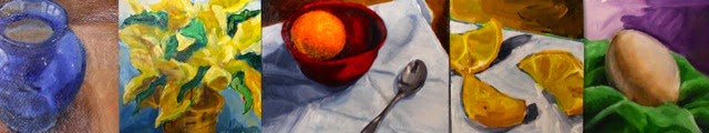
This year it is tone vs. color, which is more important?


file image-not me ;)

Hmmmmm.....?


(I know, I need to stop with the confrontational stuff, don’t I?)  Anyway I think I found the answer to this year’s question is about the same as that other one from a few years back....


not me either, just another ...file image

EUREKA!!


Neither is more important!
can’t (or perhaps in my case) don’t want to, have one without the other.  
They both need each other!


Even if I only work in color or only black and white. I have to 

1. consider the value scale and its ability to create illusionary space

2.  then and only then consider the emotional impact color (or lack thereof) will have on both the artist and the viewer.

Put another way (because I love my analogies)...


file image
It’s a dead man’s party
 (with apologizes to Oingo Bingo)


Tone (value, great scale-however you call it) is like the skeleton of the work, color is the muscle and skin, then the artist’s concept is the clothing and jewelry.


Atlas Exposed  file image


 In conversation, most of us do not think of the skeleton of the person when we meet and chat with them. Usually we notice the way they are dressed and what they have to say (aka concept).  But and here is the important part, if there skeleton, muscles and skin were not in place functioning properly, the clothing and the jewelry would not matter.  The dysfunction may overshadow the clothing or jewelry. 

In other words I think it should go-
1. tone
2. color


NEW JOB, NO TIME TO POST

So that is why this post is just in time!  I am filling in for a friend this semester.  I am teaching some of her classes at Longwood University.  One class is close to my heart, Integrating Art into the General Curriculum, something I have been doing since before my students have been born!  The other is a studio class where you can bet I will be thrilling them with the above new revelation of mine.

See you in 2018!


Tuesday, June 27, 2017

Nimrod Hall Instructor and Pochade Success!

These are photos show my very favorite way of enjoying art!!!!


With fellow traveler artists.  

My workshop participants at Nimrod Hall.  So once I got over the intimidation of teaching other professional artists, it was amazing...
what a blast to just paint, teach, watch and talk about art!!


By myself with my mini studio/plein air set up!

Got my pochade setup rocking now...it held up great for my first painting session.  

The best thing of all?  Is I get to do it again before the summer is out!

Yes it is okay to be jealous....;)

Wednesday, June 21, 2017

Homemade Pochade Box Update!


Well it took a bit a finagling (a very fancy art word there ;) But I was able to make three very functional pochade boxes at the fraction of cost of buying one new!  (FYI a pochade is a very small box that carries all necessary painting supplies and is used for on side observational work.  It can be on a table, the artist's lap or even on a tripod)


Pochade #1 on its very first trial run while attached to a tripod

Outside storms made inside study necessary.  I was able to switch very easily between watercolor and acrylic with this set up.


Last week's art supplies.  
Gave my brushes and paints a little break.


Sentimental Pochade

The best thing about this Pochade?  It was originally an art project done by my son a looooong time ago.  


It even has a little inspirational not he wrote in it too! You other mommies, aunts, daddies, teachers etc...know how much this means to me!!!


Thanks to alot of other clear descriptions and photographs, I was able to make mine to the specs that I wanted.

Note the rare earth magnets on the shelf above and lid below... would not have bought them just for this, I had them from a former exhibit.  But they have come in handy many times over. Since these magnets are very strong and easily moved around, I use them to hold the paper in place and even the water container and small palettes from sliding off the work shelf.


Ugly Yet Functional Lid Stop

One of the hardest parts was coming up with the lid stop.  I used a fortner bit and made my drill act like a coping saw (probably not the best for long term wear and tear BTW) to make this one adjustable.  While it is not the prettiest it is functional and that is what I was going for (which also explains the duct tape hinges...)


Watercolor Pochade

Here is another pochade that fits my watercolor palette and paper.  


Cuter lid stop that shows clearly shows its function


Clunky Yet Functional Feet

Used scraps to make the feet (again function over aesthetics here) for table top use. 


With the tripod quick latch ...


... and without.

If time allows I am hoping to make a flat large surface to clip to the tripod for larger pieces.  No matter what I am looking very forward to test driving these babies at Nimrod Hall Art Colony where I will be teaching this weekend!


A rough place to teach and paint, but someone has to do it! ;)


Sunday, June 4, 2017

Pochade Box

I am in love with trying to make one of these...

http://jamesgunterstudio.blogspot.com/2013/09/a-new-5-x-7-pochade-box.html

Thursday, May 4, 2017

Replication and Education (or Why Copyism ROCKS)

Below are some recent studies I have done in the style of many different artists and movements...

Expressionist Technique - Deurain


Post ImpressionistTechnique - Van Gogh


Palette and Subject - Ver Meer


Subject Matter and Palette - Fairfield Porter


Just Palette - Giotto

While I will probably not be changing my own style drastically, consciously copying these masters in either style, subject matter or palette has really helped me become much more aware of the choices I make as an artist,  as well as appreciate their choices much more as well!

Thursday, March 23, 2017

Funny Quote by Gertrude Stein


Love that is it a visual that drives home the humor...because of course it is!


Saturday, March 18, 2017

Realism and Cubism Together or Apart


A great way to fully understand an art movement...


To have to paint the same subject matter realistically and then in that style.

It especially helped me to both both canvases at the same time.  I would take one object, paint it realistically then move to the other canvas and break and repaint it down cubist style.

I would know I was painting too long when I would accidentally mix up the canvases.  Not sure which one I prefer, but I can now tell you much more about cubism than I ever thought I would ver be able to.

Main take away, it is not as easy as it looks!

Thursday, March 9, 2017

Cubistic and Realistic Still Life

A great study practice....my strategy is the paint the first object realistically, then use the leftover paint to paint the same object in a cubistic fashion on the other canvas...

Obviously these babies are still in progress...

Great Work from Winter 2017 Class!

What a fun time we had, painting, learning, solving all the world's problems...;)

These paintings certainly do not look like beginner level at all!

Fantastic work!

Click here it see the schedule for our next class!

Thursday, February 9, 2017

Abstraction/Reality Part Deux!

So the art geek in me just cannot get enough of this looking waaaay up CLOSE to artwork and seeing the little abstractions in the BIG reality.  I blame (or thank) both Chuck Close with his gridded portraits of the 90s (zoom in close on one and see what I mean) as well as digital photography...


Yes it is such a geeky love of mine that I took about 1000 close ups photos of paintings in the louvre.  Just like these...


And yes sometime I spend my evenings just scrolling through them...


looking at them, I try to see the technique and palettes used, trying to guess what the artist was thinking and planning while creating their masterpiece ...


Thursday, February 2, 2017

Forging for What? Aesthetic Experience vs. Financial Investment

Did you know that by some estimates, as much as 1 out of 3 pieces that you see in a museum are forgeries?


 In fact it is so prevalent that some museums are now hosting shows devoted to forged art!


Shocking, isn’t it?


Or is it?  Really?

Art forgeries are not as bad as say, terrorism, famine, and catastrophic illness... I think we would all agree. While it does sham many out of millions, could this be just a large scale buyer beware situation?


In fact, if you do not personally invest huge wads of $$$$ into the art market, it may actually be kind of intriguing...this Youtube video on the history of art forgery sum it up quite nicely.


This article from NPR puts an fresh perspective on it for the little museum goers, like you and me...Signature vs. Architecture in paintings (and other forgeries).   I really wish NPR still had the comments section for this one, would love to hear the overall reception of it.  It brings up a great point, should the average viewer really even care if it is a fake or not, should that come into play at all with the aesthetic interaction they are having with the piece right in front of them?

Happy Reading! And Pondering!

Tuesday, January 31, 2017

In Reality, It Is ALL Abstract!


And the scale!  Take this warm/cool study I just finished...

Here is the whole image, and it is fairly realistic by my standards of viewing and style of painting...


24"x18"


And now at super hyper close-up....


...these images are standing on their own...


                                                              ...but give a totally different feel


                                    ...even if you can tell which part of the big picture it is.


Try this the next time you see realistic large scale paintings, try to get as close as possible to see the abstractions...a wild way to interact with art!