.

.

Wednesday, December 31, 2014

Meh

Part of painting everyday. ..

 I am just not going to be thrilled with each one.  This is a wilting poinsettia leaf that I was trying (unsuccessfully) to capture the puckering between the veins .


Gonna try this guy again tomorrow in watercolor...but rethink the technique

Monday, December 29, 2014

Last of the Lemons

Okay just had to work with the lemons in just one more medium...oil.  But now, I think it is off to that great compost pile in my backyard for them.  They have served me well...


Oldest Lemons
oil on panel
6”x6"

Saturday, December 27, 2014

Daily Studies

Now that my long term sub is done and the holidays with all their blessed craziness are also in the rear view mirror, it is back into the studio...


Leftover Lemons
6”x6” 
watercolor


Old Orange
6”x6”
watercolor


West Coast Rocks
6”x6”
watercolor

Teaching vs Creating

I just had the best most exhausting December, ever...


Me after work everyday this month...


Personal Note: For those of you who don’t know... as much as I love love art,  I would go crazy if I only worked in my studio or gallery.  My first art career was as a public school art teacher and while I adored it I could not handle the insane amount of time required after my own kiddos came on the scene.  On top of the regular teaching and grading, with teaching art extra time is needed for material ordering, prepping, clean up, and exhibiting.  
Yet I truly miss being around all that energy and curiosity as well as being a part of a caring staff working together to inspire students to develop into the best they can be.  So these days I try to find ways to balance studio time with getting back into the classroom without those crazy long hours that only a public school art teacher can relate too.  

Hence I now do something I would have scoffed at 20 years ago (never say never, right?)  

I substitute teach.  

But not this kind...


this kind...

So I just spent the last month with an adorable class of kindergarteners while their teacher took longer to recuperate from knee surgery than previously planned.  
I feel very fortunate that I am able to use my skills from teaching to truly help others out when it is really needed.  

I don’t get all the negative PR with substitute teaching.   If you ever want to feel like a Santa Claus/Rock Star walk into the door of just about any school to sub.  And here is the most awesomesauce part...you can leave right after the kids...no faculty meetings, staff development workshops or extra mandated projects.  This is why I keep my teaching certificate up.


But now that it is done I am raring to get back into the studio!!


Thursday, November 20, 2014

Inch by Inch...


This is where the image of the week idea meets the road...I got a call to teach at the last minute.  So I did not have that much time in the studio.  

So I just went ahead and blocked in three substrates...paper, block and clapboard.  

This will tee me up for lots of painting tonight! 


Tuesday, November 18, 2014

Image Week #1 COLOR

Now it’s Tuesday and I am moving from tones and proportions to adding color...


Working in dry media first...  a color map sketch with color pencils to decide my palette.


Now my “coloring book” stage.  Applying flat washes in local color.  Decided to use yellow as an under layer for the grass


Starting to figure out more about my composition as I get to this stage...such as my strategies for showing space both physically and emotionally in my subject matters.  I am taking notes about it in my sketchbook laying nearby.   I added the faintest of washes in the background to change the spatial feel of the entire composition.  I washed my brush out twice to get that faintest of Payne’s Gray wash in the background.


Using size and spacing of my green grass blobs over the yellow to begin that definition of space...


Now I add in either a stronger pigment or darker the flat first color to add depth.  


So finished for today.  As I am running around doing those exciting domestic things like laundry, paying bills, walking the dogs and cooking, in the back of my mind I will be kicking around the techniques and strategies I came up with today and yesterday as I created these


Which will help me make the next big decision, what media to work with.  To stay with watercolors or move to acrylic and/or oils....


Monday, November 17, 2014

Image of the Week #1

Always looking for new ways to jazz up my studio practice.

This idea is courtesy of my new artist friend Nadya Warthen-Gibson.

Drum roll please....

In the spirit of my Hot 100 series of past yore, I am now working on an image of the week, for only that week, and posting (hopefully) daily progress here, with weekly updates on FB.

Tahhh-daah!


Here is this week’s reference photo...my half pint muse at my goddaughter’s wedding...


“ Hmmmm, I wonder if they will like the designer toaster I got them..."


And now a sketch I have made of it today...


Moving onto a 5 step value scale study  to see if spaces and shapes will work out.


just the faintest wash first, barely able to see the highlights...


bringing in the value scale as a reference guide...


no details wanted here, just rendering major shapes and groupings...


pushing to the far end of the value scale to give a sense of space.


This monochromatic study and sketch will both be a big help when I start to work with color tomorrow.

Little Man Hits Abstract Beach & Art Roulette 4+3=1


So okay,  I may not be posting...but I am painting! The culmination of my Waiting for the Next Wave series.  Trying to balance realism with abstraction in this one...


Little Man in the Sand  
Acrylic paint
22”x34” approx.  
2014


And also...

The images of my art collaboration with Team #13

From the Art Roulette Collaboration  of area RVA and beyond artists

4 (artists) + 3 (panels) = 1 (finished piece)


4+3=1
Acrylic paint, string, tape and metal on board
24”x78” approx.
2014


These will be raffled off with 24 other pieces done by over 90 artists this Friday at Artspace Gallery.  Tickets available through me or the gallery website.  


Thursday, October 9, 2014

Art and Social Change


file image: Melbourne Street Art


Trolling through FB this morning because, well, I just did not want to really do anything productive...but art slapped me in the face.  Not once but TWICE!

First was a post from a friend whose son is now traveling to the Ukraine helping those who have had their a art community center taken from them and turned into a prison. You can read a bit about it here.

Blew. Me. Away.  To think this young guy who I bounced on my knee as an infant is going halfway across the world to a very dangerous place to help others to be able maintain or regain their ability to express themselves.

Then I happen across this other piece that puts in into a larger and poignant context.  Sarah Lewis nails just why and how art experiences have inspired and sparked many social justice movements.


Once on the page, just scroll down just a touch to find the video link. This is an incredibly concise and insightful explanation about how the aesthetic affects and even creates social change.

Wednesday, October 1, 2014

Materials and Color Geek Fest!

Wow! just fell into the most amazing art experience last weekend.

 I think it will make me a very happy, geeky artist for a while.  Maybe even as happy as I am below...

Happy artist me with one of my biggest, dearest supporters, Helen Ardman


Artist Workshop Demo

Thanks of Kris Iden at VisArts in Richmond Virginia, some extra time on Saturday since my kids baseball game fell through, Amy Shawley-fantastic workshop artist, and the Golden Acrylic Company I got to finally find out what the paint I have been using for the last oh 1/2 my life is made out of!


So just what are you made of?  It's ok, I can handle the truth..


Shameless marketing?  Or shrewd business plan?
I thought it was going to be one, but delightfully actually turned out to be the other! Or maybe it is both, will find out just how much of this new stuff I start buying in the next few months.


Chemistry Flashbacks-the good kind

Now I am reading all about oils, polymers, chemistry, molecular structures and the history of pigments. (My personal favorite cool discovery in this...there are two sets of pigments-mineral and modern, who knew?)You, too, can read more about some of this in Golden's newsletter called Just Paint.  Look up the Safflower Oil Paints article in particular...very good to geek out to.

Actual Chemical equation for oil paint. 

Incredibly, eerily similar to oil we cook and eat 


Cool illustration of chemical bond.  Just here for looks


 I know my high school chemistry teacher, Sr. Eileen  would not believe that I am actually getting into this subject matter willingly...but yes it is true!


Not actually Sr. Eileen- but feel this would have been her response had she known about
my recently discovered love of chemistry.

So now I am experimenting will all sorts of cool things in my studio, like acrylic skins, pastes and gels.  I cannot wait to teach this stuff.  


But wait!  There is even more!

You can geek out on books about this too!  (Remember those?)  So Amy recommended Bright Earth by Phillip Ball and apparently so did lots of other folks on Amazon.  And because Amazon knows a sucker when they see one, recommended another color book for me on the history of pigments called Color-A Natural History of the Palette by Victoria Finlay.  Well thankfully for my wallet, I am not a total sucker.  I am getting the second book from the library first ;)


Looking forward to getting to know you guys better...


so I can get you to do exactly what I want you to here.


and of course,  here.


The Take-Away

So any of you artists out there ... if you ever have the opportunity to take a materials workshop from a paint manufacturer, don't shy away because you are afraid it is only a dressed up sales pitch.   Go for it!  You will be amazed at what you will learn.  If you want to seek them out, hit the website of your favorite art materials company and I bet you dollars-to-donuts that they will have a schedule of workshop demonstrations or a request form.  

Happy Exploring!


Wednesday, September 17, 2014

Anatomy of a Series "Waiting for the Next Wave"

"Where do your ideas come from?"

"Why do you paint what your do?"

These are questions every artists get asked.  Ones that I used to brush aside for years. (unintentional pun there, honest) But lately I have been revisiting and re-inventing these, which is one of the cool things you can do with any creative endeavor; a free form evaluation of sorts (at least as much as your free time and/or client demands will allow).


Part 1 Selection and Planning


Selecting the Image

Facebook, like everything else today, is revolutionizing this process for me.  I tool along my FB stream and when I see an appealing image I place it in a folder and then come back to it, to see if it really still "speaks" to me (pompous artists talk I know, yet best word choice here).  The idea of having someone pose for me with my crazy schedule is not a possibility at this point.  Besides most people hate posing and I detest trying to recreate the perfect light with each sitting.

So to the photos I go...in my subjects I am looking for three things:
1. sentimentality
2. strong composition 
3. good balance of lights and darks

Just about a month ago a cute young family I know posted this photo among others of their last day of their family vacation at the beach...

Little Man at the Beach

This cute guy has it all going for me. 

 1. Sentimental- I absolutely adore this little man.  My sister’s grandson.  He rocks the coolest amber necklace and will play ball with you until the cows come home. Plus he is at the beach!  What's not to love? 

2. Composition-I also fell in love with this composition.  His arms are in a great dynamic angle, those cute chubby splayed fingers will be a delight to render.  The foreshortening of the arm and slight bird’s eye view speak to my love of perspective.   

3. Lights and Darks (a.k.a. tonal scale)- The natural lighting creates a solid range of lights and shadows that I am looking forward to working with.  Clear cut cast shadow and mid-tones help to define form on those cute cubby little fingers, toes, cheeks, etc...


Sketching It Out

Just because all the above check out doesn't mean it is a go for me.  To clinch the deal, I work through a series of progressively complex sketches to make sure my eye and brain want to work with this image too...

Gesture Study

First a few quick gestural sketches to get the feel of the composition...


Mapping Study

Secondly a slower sketch or two to plan out lights and darks as well as work on proportions
 (for later reference, like a map) 
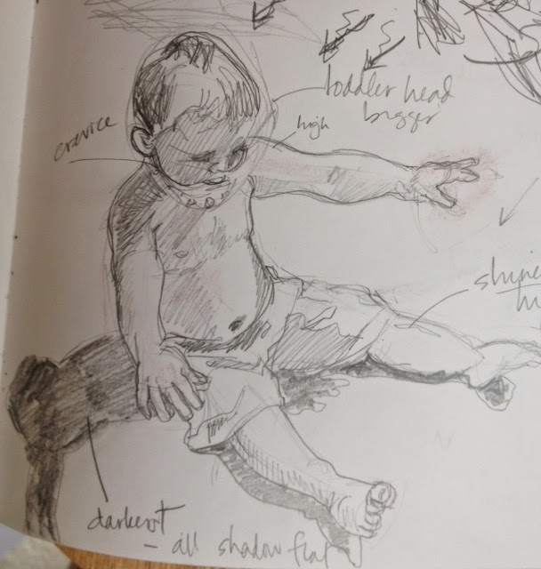


Contour Study

Next it is onto sketches that emphasize the contours of the subject.  In this case, I wanted to really get down those cute little toes, tummy, fingers and cheeks.  


My final set of prep sketches do look a little creepy...disembodied baby arms and legs.   But I have good reason to do these.


I draw these close up details of areas that I think will make the piece distinctive or may be challenging.  In them, I combine contour with tonal scale.  This is where I start planning to take some "artistic license" in my upcoming paintings.  (For example, I decided that this point to leave the sand off of the fingers and toes as well as the pattern off of the swim suit...)


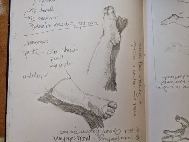
Detailed In-Depth Studies


In-Process Study

I will still occasionally go back and do some in process sketching during painting when I need to get rid of color because it is getting the way of decisions I need to make...


Planning a Series

So now I know this image is a go.   Because I do not want to keep re-inventing the wheel, little man and I will be hanging out a while together.  He will be the subject matter for my next 3 or 4 paintings.  I use all these decision making and planning for this composition in which I will change up either process, scale and materials...


Have you noticed?

1. These sketches do not really look like the little man, do they?

2. Several hours into this and no paints to be seen yet!

Part 2 Image Transfer and Actual Painting


"Are you allowed to do that?"

"That's not right, is it?"

These kind of questions used to frustrate me but now they flatter me.  It’s good to know others are getting that interested in my art and process to ask them.  Besides, I should know the answers to them since I am the artist, right?


Transferring the Image

Okay, true confession time.

 Sometimes I use mechanical and/or tracing devices to put my image on the ground. And (shudders) I teach others to do it too.  Yes at times I feel like when others find out this dirty little secret of mine, it's like I have just been caught selling illegal drugs to little bunny babies or something like that.  (Which I would never do BTW)

Well if I am guilty of a crime, then so is Michelangelo and DaVinci.  They did it too!  In fact some of the figures on the Sistine Chapel are the same image repeatedly transferred.  He just changed the details, like hair and clothing to make them individual.

Besides,  my sketching abilities are well used in the planning stage where it does serve a crucial point. Sketching gets me and my brain planning and thinking much more in depth than I would by just looking.  It is not that I do not want to draw free form on my final ground.  I often do but at certain times (in this case, a small image size 6"x6") I want my image to be as clean as possible.  

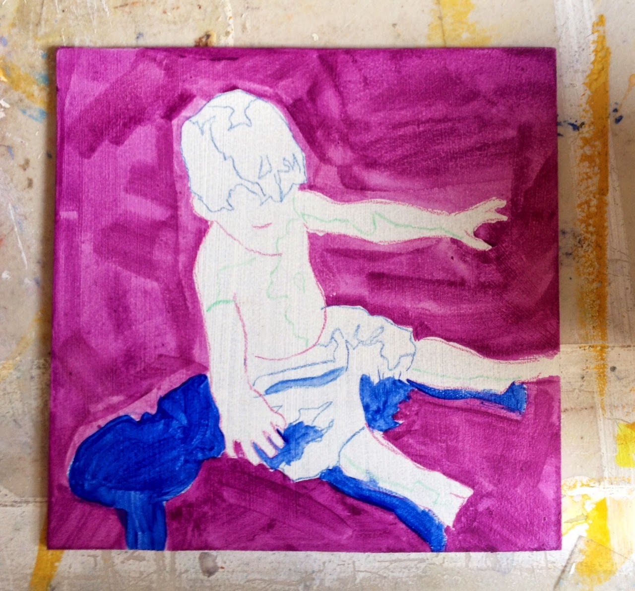
So I use my projector and make three image transfers onto 6"x6" gessoed masonite boards.  No photos since it is not very exciting...


Actual (Under) Painting!!

Called dead coloring by the old masters,  it was originally a monochromatic tonal study under the final work to add richness to the finished oil painting.


Halfway Finished Underpainting with Image Transfer

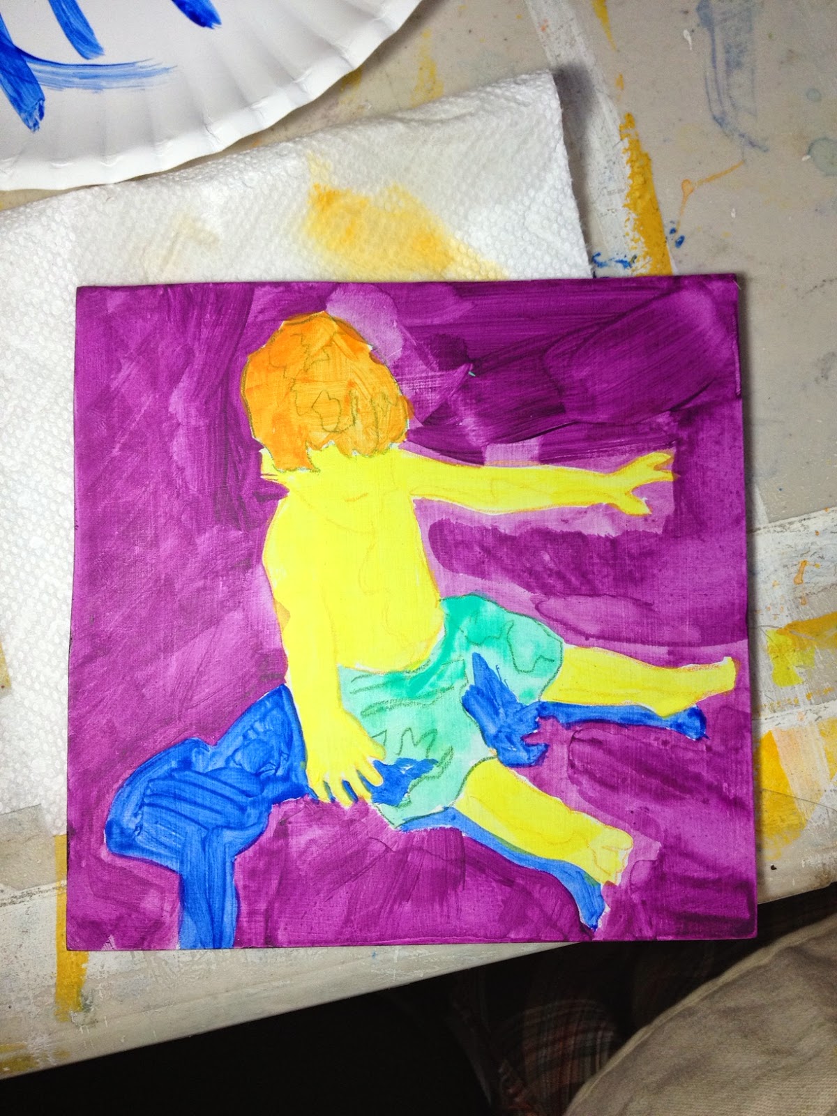
But being the child of Pop Art that I am and using those lightening fast-drying acrylics, I like bright subjective colors in my underpainting.  Would not exactly call these colors "dead".  I think it's more like Warhol than Vermeer here...

(BTW I think any of these paintings from here on out can be considered "finished" paintings.  It is just a matter of how far the artist wants to push it, what they are trying to achieve.  Obviously, realism dictates more steps and greater detail)

Finished Underpainting
Palette: ultramarine blue, turquoise, lemon yellow, cadnium orange, and  dioxazine purple.

These color have nothing to do with tone and everything to do with the energy I want the piece to convey (more 60's new agey influence here).  Just how much these will remain visible in the finished pieces are decided on later. But no matter how much I try to cover it all up the sense of color from the underpainting will always peek through.


Real Actual Painting

Hot dog!  Now I can finally get down to it!  I have selected my local colors and put them aside on my table.  I usually keep my palette to about 5-7 colors (buff white, burnt umber, red sienna, paynes' gray, naples yellow and ultramarine blue for my little man) and mix whatever else is needed from there.  

The beach sand is a combination of buff white and burnt umber...also a glaze of red sienna helps to calm down that hair and flesh tone settles down that lemon yellow too, doesn't it?  Yet looking closely you can still see the ultramarine shadow under the sand-that is why "hyper-energy" colors are used it the underpainting.


I usually paint one of several orders as the rest of the painting allows me...either 
1. big to small  
2. back to front  
          or 
3. top to bottom


Moving up and down the scale

So little man is coming along.  I have put in all the local colors. and been playing with the tonal value of his hair by adding burnt umber and naples yellow. He is starting to look more like his photograph...


Now it is just a matter of how small to paint, how far to go out on the edges of the value scale.  Using acrylics gives me the blessing and the pressure of a quick open time (how long it remains wet after application).  This forces me to make fast decisions on one hand but on the other, it allows me layer as much as I want.  


Tonal values start to make this figure pop off the ground


An occasional reference back to the photo lets me know things are still working...


Further details, some glazing and ...
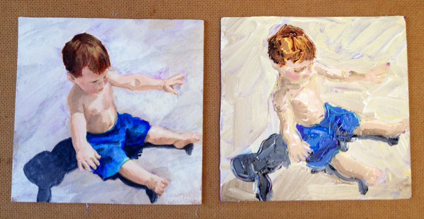
Finished!

Waiting for the Next Wave-slow version
Acrylic Paint 
6"x6"
2014


You’ve Come Along Way Baby


5 Hours vs. 5 Minutes

Now comes a really fun part.  

I take all that decision making and experimenting from the first painting and put it into my second one.  Remember that other board I also image transferred and underpainted then put aside?    Because I am painting the second one in about 1/300th of the time that I took to do the first one,  I mix all my colors ahead of time first....obviously so I can work faster.

Still working in the same order but sloppier.

Big to Small.  Back to Front.  Top to Bottom.


Since my form was not as defined as I wanted, scraffito lines were put in to clarify the figure, with the delightful extra of revealing those hyper underpainting colors.  


Waiting for the Next Wave-fast version
Acrylic Paint
6"x6"
2014


 What a difference technique makes!  Everything else is just the same.


All dressed up their new frames and ready for my wall at CrossRoads Art Center