.

.

Wednesday, January 20, 2016

2016 Year of Academy on a Local Budget


After the Holidays
watercolor on Arches
6"x12"


Last year was the weekly studies and this year will be the year I finally get to learn traditional technique in both watercolor and oil. Since I cannot just abandon my family for 12 months and go to the Philadelphia Academy, I am calling it my "Academy on a  Local Budget" year. So with that in mind, I began looking for two teachers here in RVA who teach traditional rendering techniques.

I quickly found two great teachers in Christopher Winn for watercolor and Colin Ferguson at John Tyler Community College in oils.  Here are two quick studies I just did in the past few days...one above and one below
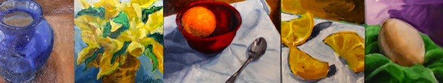


Enamel Pot Study
oil on gessoed paper
14"x16" (approx)


This is the first oil painting I have done with the traditional method of underpainting and grisaille. How did I get two art degrees without it?  I blame on the love affair with abstraction going on at the time.

I also am discovering that studying two different painting mediums at the same time makes me a bit of a rebel.  But I am enjoying it.  It is kind of like speaking two languages, you aim to get to the same understanding but just as you have different vocabulary and sentence structure with words there are different mediums/vehicles, along with order of value development with painting.


And one medium is much more forgiving of mistakes than the other...
you might be surprised which one is.  Another post another day perhaps?


Also another plus in this adventure for 2016, taking and paying for classes will make me produce more (fingers crossed).

Wednesday, January 6, 2016

Color Me Nerdy

So I finally did it....

After TWO university degrees in art and painting, you’d think I would have been assigned this....I know I will atleast heavily suggest this to my students. (Yes I am that kind of art professor).


I finally made my first color chart!!


Wow and did I ever learn a lot!!  It got my watercolor process grooving (yes I know it is not really a painting, art or process word but it does seem the best one to use).  This color chart made me think much more in-depth about my mixing proportions, viscosity of the paint, tinting the best way possible.  Finally, the repetition (120 of those little suckers) forced me fine tune my mixing and application to make things more accurate than I normally strive for.


It is all about the proportion of pigments

75/25----50/50------25/75


Not only that, I now have a handy dandy reference guide to refer to later.  

This is so cool because it is useful in so many ways. I can now have better control over my palette, not spend a ton of $ on all sorts of funky color tubes... I can just mix my own funky colors!


Buh-Bye Guys!
(Well, maybe we can still be friends...)


Special thanks to Christopher Winn for the palette selections and Watercolour Journey for the set-up and mixing process.