.

.

Wednesday, September 17, 2014

Anatomy of a Series "Waiting for the Next Wave"

"Where do your ideas come from?"

"Why do you paint what your do?"

These are questions every artists get asked.  Ones that I used to brush aside for years. (unintentional pun there, honest) But lately I have been revisiting and re-inventing these, which is one of the cool things you can do with any creative endeavor; a free form evaluation of sorts (at least as much as your free time and/or client demands will allow).


Part 1 Selection and Planning


Selecting the Image

Facebook, like everything else today, is revolutionizing this process for me.  I tool along my FB stream and when I see an appealing image I place it in a folder and then come back to it, to see if it really still "speaks" to me (pompous artists talk I know, yet best word choice here).  The idea of having someone pose for me with my crazy schedule is not a possibility at this point.  Besides most people hate posing and I detest trying to recreate the perfect light with each sitting.

So to the photos I go...in my subjects I am looking for three things:
1. sentimentality
2. strong composition 
3. good balance of lights and darks

Just about a month ago a cute young family I know posted this photo among others of their last day of their family vacation at the beach...

Little Man at the Beach

This cute guy has it all going for me. 

 1. Sentimental- I absolutely adore this little man.  My sister’s grandson.  He rocks the coolest amber necklace and will play ball with you until the cows come home. Plus he is at the beach!  What's not to love? 

2. Composition-I also fell in love with this composition.  His arms are in a great dynamic angle, those cute chubby splayed fingers will be a delight to render.  The foreshortening of the arm and slight bird’s eye view speak to my love of perspective.   

3. Lights and Darks (a.k.a. tonal scale)- The natural lighting creates a solid range of lights and shadows that I am looking forward to working with.  Clear cut cast shadow and mid-tones help to define form on those cute cubby little fingers, toes, cheeks, etc...


Sketching It Out

Just because all the above check out doesn't mean it is a go for me.  To clinch the deal, I work through a series of progressively complex sketches to make sure my eye and brain want to work with this image too...

Gesture Study

First a few quick gestural sketches to get the feel of the composition...


Mapping Study

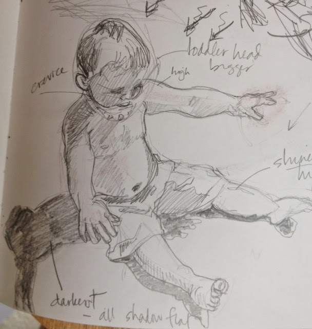
Secondly a slower sketch or two to plan out lights and darks as well as work on proportions
 (for later reference, like a map) 


Contour Study

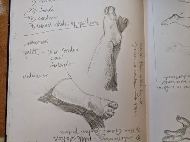
Next it is onto sketches that emphasize the contours of the subject.  In this case, I wanted to really get down those cute little toes, tummy, fingers and cheeks.  


My final set of prep sketches do look a little creepy...disembodied baby arms and legs.   But I have good reason to do these.


I draw these close up details of areas that I think will make the piece distinctive or may be challenging.  In them, I combine contour with tonal scale.  This is where I start planning to take some "artistic license" in my upcoming paintings.  (For example, I decided that this point to leave the sand off of the fingers and toes as well as the pattern off of the swim suit...)

Detailed In-Depth Studies


In-Process Study

I will still occasionally go back and do some in process sketching during painting when I need to get rid of color because it is getting the way of decisions I need to make...


Planning a Series

So now I know this image is a go.   Because I do not want to keep re-inventing the wheel, little man and I will be hanging out a while together.  He will be the subject matter for my next 3 or 4 paintings.  I use all these decision making and planning for this composition in which I will change up either process, scale and materials...


Have you noticed?

1. These sketches do not really look like the little man, do they?

2. Several hours into this and no paints to be seen yet!

Part 2 Image Transfer and Actual Painting


"Are you allowed to do that?"

"That's not right, is it?"

These kind of questions used to frustrate me but now they flatter me.  It’s good to know others are getting that interested in my art and process to ask them.  Besides, I should know the answers to them since I am the artist, right?


Transferring the Image

Okay, true confession time.

 Sometimes I use mechanical and/or tracing devices to put my image on the ground. And (shudders) I teach others to do it too.  Yes at times I feel like when others find out this dirty little secret of mine, it's like I have just been caught selling illegal drugs to little bunny babies or something like that.  (Which I would never do BTW)

Well if I am guilty of a crime, then so is Michelangelo and DaVinci.  They did it too!  In fact some of the figures on the Sistine Chapel are the same image repeatedly transferred.  He just changed the details, like hair and clothing to make them individual.

Besides,  my sketching abilities are well used in the planning stage where it does serve a crucial point. Sketching gets me and my brain planning and thinking much more in depth than I would by just looking.  It is not that I do not want to draw free form on my final ground.  I often do but at certain times (in this case, a small image size 6"x6") I want my image to be as clean as possible.  

So I use my projector and make three image transfers onto 6"x6" gessoed masonite boards.  No photos since it is not very exciting...


Actual (Under) Painting!!

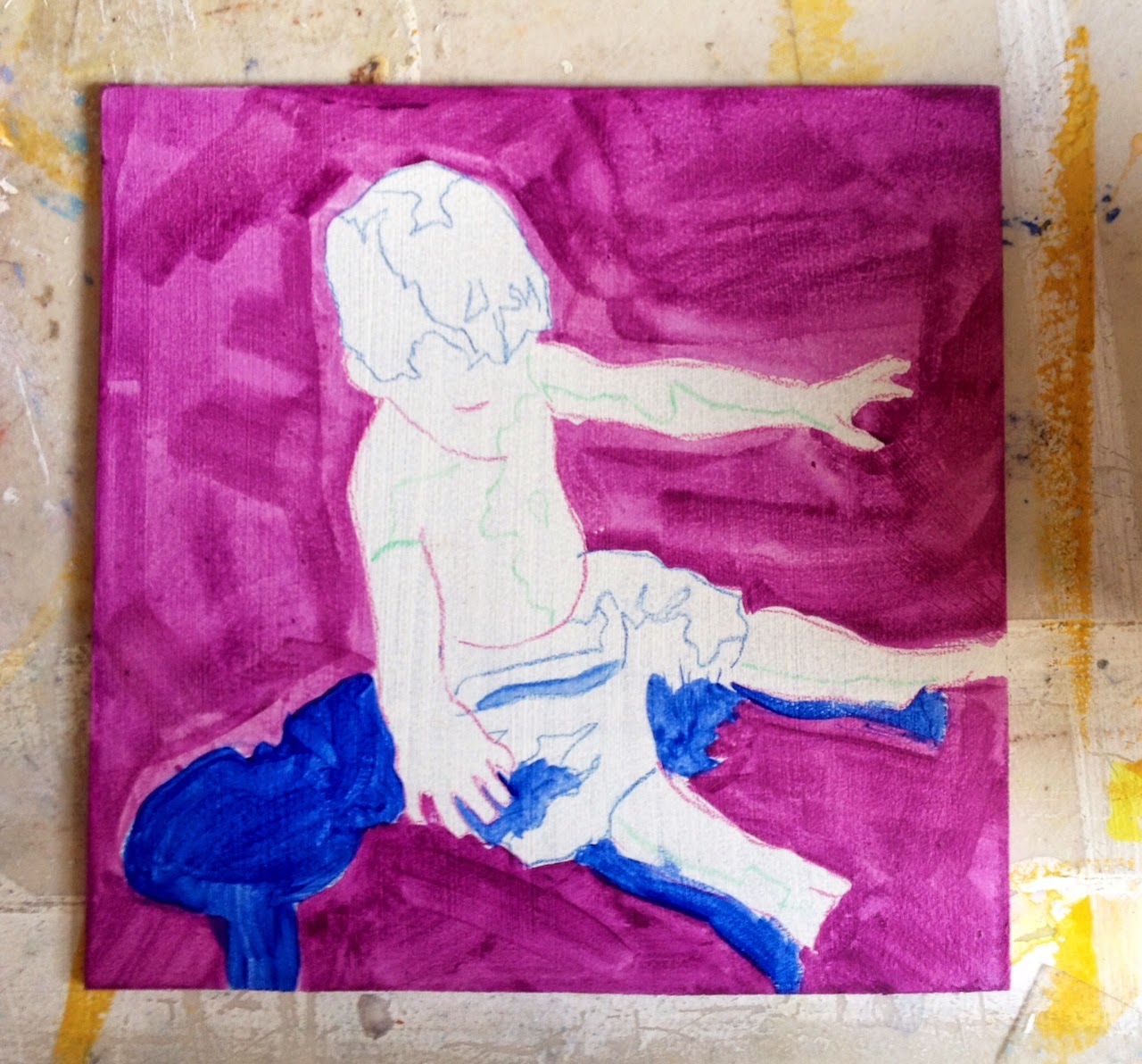
Called dead coloring by the old masters,  it was originally a monochromatic tonal study under the final work to add richness to the finished oil painting.


Halfway Finished Underpainting with Image Transfer

But being the child of Pop Art that I am and using those lightening fast-drying acrylics, I like bright subjective colors in my underpainting.  Would not exactly call these colors "dead".  I think it's more like Warhol than Vermeer here...

(BTW I think any of these paintings from here on out can be considered "finished" paintings.  It is just a matter of how far the artist wants to push it, what they are trying to achieve.  Obviously, realism dictates more steps and greater detail)
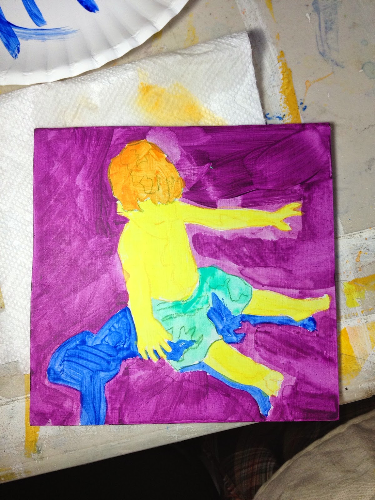
Finished Underpainting
Palette: ultramarine blue, turquoise, lemon yellow, cadnium orange, and  dioxazine purple.

These color have nothing to do with tone and everything to do with the energy I want the piece to convey (more 60's new agey influence here).  Just how much these will remain visible in the finished pieces are decided on later. But no matter how much I try to cover it all up the sense of color from the underpainting will always peek through.


Real Actual Painting

Hot dog!  Now I can finally get down to it!  I have selected my local colors and put them aside on my table.  I usually keep my palette to about 5-7 colors (buff white, burnt umber, red sienna, paynes' gray, naples yellow and ultramarine blue for my little man) and mix whatever else is needed from there.  

The beach sand is a combination of buff white and burnt umber...also a glaze of red sienna helps to calm down that hair and flesh tone settles down that lemon yellow too, doesn't it?  Yet looking closely you can still see the ultramarine shadow under the sand-that is why "hyper-energy" colors are used it the underpainting.


I usually paint one of several orders as the rest of the painting allows me...either 
1. big to small  
2. back to front  
          or 
3. top to bottom


Moving up and down the scale

So little man is coming along.  I have put in all the local colors. and been playing with the tonal value of his hair by adding burnt umber and naples yellow. He is starting to look more like his photograph...


Now it is just a matter of how small to paint, how far to go out on the edges of the value scale.  Using acrylics gives me the blessing and the pressure of a quick open time (how long it remains wet after application).  This forces me to make fast decisions on one hand but on the other, it allows me layer as much as I want.  


Tonal values start to make this figure pop off the ground


An occasional reference back to the photo lets me know things are still working...


Further details, some glazing and ...

Finished!

Waiting for the Next Wave-slow version
Acrylic Paint 
6"x6"
2014


You’ve Come Along Way Baby


5 Hours vs. 5 Minutes

Now comes a really fun part.  

I take all that decision making and experimenting from the first painting and put it into my second one.  Remember that other board I also image transferred and underpainted then put aside?    Because I am painting the second one in about 1/300th of the time that I took to do the first one,  I mix all my colors ahead of time first....obviously so I can work faster.

Still working in the same order but sloppier.

Big to Small.  Back to Front.  Top to Bottom.


Since my form was not as defined as I wanted, scraffito lines were put in to clarify the figure, with the delightful extra of revealing those hyper underpainting colors.  


Waiting for the Next Wave-fast version
Acrylic Paint
6"x6"
2014
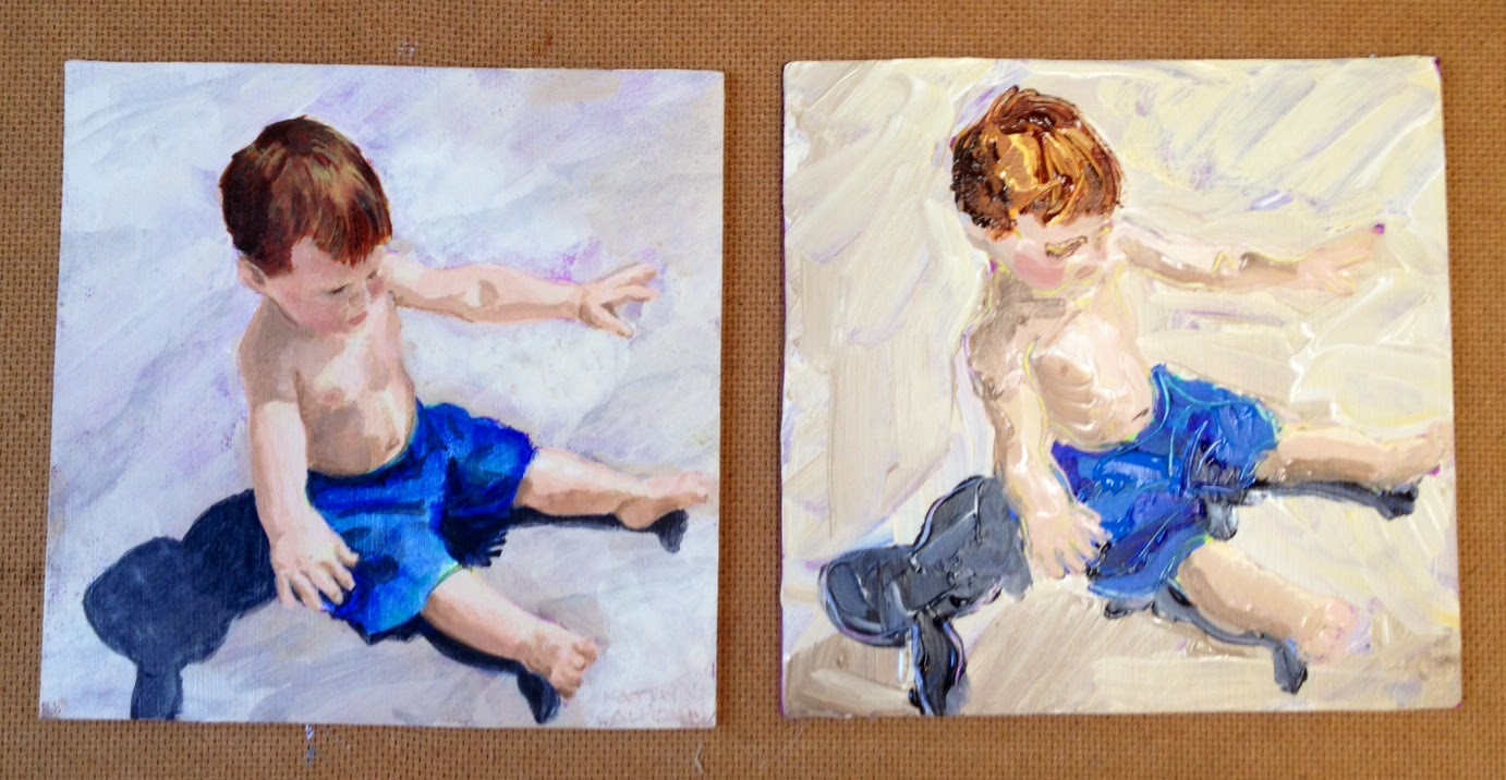


 What a difference technique makes!  Everything else is just the same.


All dressed up their new frames and ready for my wall at CrossRoads Art Center


Tuesday, September 16, 2014

The Joy of Trashing Your Own Art

As mentioned in the last post, I am getting into my studio on a regular basis and loving it!   But it did not just happen on its own.

file image 1870s illustration

I thought it would be a great review(at least for me personally) to write about how this came about.  It was a confluence of several art resources that I regularly reference.  Prologue  of which is just getting my children out the door to school...

First is an amazing blog, ArtBizCoach.  Alyson Stanfield does a bang up job in helping me to refocus and push forward, both artistically and with my marketing. Bucket list item:  take one of her workshops with added bonus of visiting one of my favorite places on the planet-Colorado

In a post this summer she asks what do other artists do with the old inventory that no longer speaks to them and in true creative fashion, turns it into a fun contest.  Here is that post,  The Best Idea for Unloading for Unsold Art.  The winner has a party where she has a big bonfire and burns her excess work.

file image


Wow how freeing is that? 
(Okay a little creepy and destructive but also liberating.)


So I did just that a few weeks ago with out the fanfare.  In fact, I made sure no one else was home so I would not have to listen to any spousal protests or children's declarations of my weirdness.  My dogs did enjoy it so maybe I will expand my guest list next time.

It forced me to thoroughly clean my studio and added bonus:  student files were found that should have already been destroyed.  No I am not a pyromaniac in the making but it is incredibly cleansing to know this stuff is gone forever (except for digital files) and then have a blank slate to work with.

PS  I also added to the cleansing by taking down lot of the artist cards and even photo of special people and filed them away for the time being.  They are waaaay to precious to every consider burning but having blank studio walls helps with the creative flow and focus.

PPS The added extra bonus of finding gems like this underneath all the art clutter...

Learn to Draw the Human Figure with Mary Jo and Jon Gnagy

Which led to my next step in getting back into my art groove

Tuesday, July 1, 2014

Collaboration Madness!

I know most of us lament how the digital age has pulled everyone into their own little shells,


but I am fortunate enough to be involved in not one but two collaborative projects that would not have been possible without email.


First, I am lucky enough to be working with a very talented writer through the Richmond Writer’s Workshop.


She is a lovely 11 year old who is wrote her own fairy tale that I am currently illustrating.  And since we live about 40 minutes apart, the best way to confer is, you got it....

      BTW those are my working sketches in the bottle ;)


But the second collaboration is the big kahuna/mystery one.  It is called Art Rouellette and it is happening this fall.  Here is Artspace Gallery’s neato video explaining it.  


No working sketches yet since I have no idea who I am working with (that is the roulette part) and so also have no idea what we will be doing.  

How would you feel about doing a project like this?  Nervous?  Excited?  Then you are just like me.  The big hope is that this collaboration madness will take us all out of your shells.


Wednesday, June 11, 2014

Art, Beauty, Teaching, and Aging with Milton

Ever talk with someone who is so intelligent and yet so simply articulate it is more a pleasurable performance than actual conversation?

If you would like to have that experience now, just click on this link right here...

Prepare to be amazed by this man


How I would love to meet with and talk with this guy!  Like the opening notes say, while he is a virtual unknown to even most people in the art world, Glaser is probably this most influential art critic ever... oh and BTW also the graphic designer who created little things like the NY logo.


Happy watching!


Saturday, May 31, 2014

Art Student Graduate Gift

Ever get asked the same off-the-wall question again and again?

As an art teacher, mine is, “What is a good graduation gift for an art student?"

Well $$$  always is nice but this book is a great way to give a little something that hopefully lasts a bit longer.


101 Things to Learn in Art School by Kit White

“But wait.” most people say “aren’t they supposed to know all of this already?” Well yes, but I like to  think of it as insurance against forgetting everything they learned in the next 10 years or so...

As those of you of a certain age, may remember Saturday Night Live’s Father Guido Sarducci explained this phenomenon and his solution to it in the 5 Minute University.

Tell It Like It Is Padre

I guess my idea is the $12.95 rebuttal to his, so I save you about $7.03 (after discounting initial college tuition of course) 

Happy Reading! (and viewing)

Monday, May 5, 2014

EarthDay Sale…People+Art=SUCCESS!!

This is now what our gallery storage space looks like! 

Real Photo of (some of our) Real Storage at our Real Gallery, Artspace

I am pleased as can be to report that we had a whopping 587 people visit our little gallery for the
  Pay-What-You-Wish Sale during the Manchester EarthDay celebrations.  Not completely sure, waiting for verification, but that may be a daily attendance record in the 26 year history of the gallery.  

This Bin Was a HUGE Abandoned Art Sale Hit!!

We made enough $ to help cover our rent this month and while that is of course a great thing to be able to do, this sale created many many other fantastic and touching moments that were not planned and will never make their presence known on any balance sheet...


(file image)

Like the father and 8 year old son discussing art, labor costs, fair market value and chore allowance. They later came back and the boy delightfully bought his “prize” while excitedly telling me all about how he came to his decision and the extra chore he is doing to earn the $.  Way to create a teachable moment Mr. IT job father with the music education background-
you sir, are one AWESOME parent!

(another file image)

Also, the woman who told me she only had $5 for her purchase.  I said that would be more than fine and then she returned from a special ATM trip to add another $10 more.  Thank you anonymous woman who bought the Bill Nelson prints for coming back.  You and your generosity ROCK!


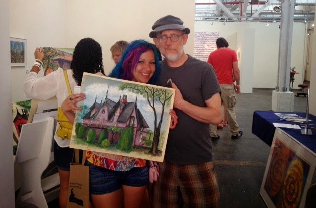
Michael and new friend, the cool blue and pink haired chick*

Most touching moment- dear friend and mentor, Michael Pierce donated many works from his student days and also work from his grandmother.  They were the absolute hit of the sale and this girl was thrilled to meet the grandson of the artist who painted this work she had just purchased.  Of course it also goes without saying that you two also in your own special artist and patron ways, ROCK IT as well.

But then again I should not be surprised, connecting art and people with just a little preparation and planning is always a winning proposition.

Thank you so much RVA!

Kathy


(*BTW got permission from her to refer to her as such)


Friday, April 25, 2014

Awesome Art Sale-You Name the Price

Still obviously on that moving purge thing I talked about earlier in the year,  so when I was tripping over leftover artwork at the gallery’s storage area this idea sprang to mind...


Not the actual storage area for Artspace Gallery 
but gosh darn it is pretty close. You get the idea

It inspired me to have the first and probably only...

Graphic Design Credit John MacLellan

That’s right, we are selling artwork that has been kicking around that storage area for years.  It was not claimed by the artists after their shows came down.   This is either going to be a really neat event or big headache…time will tell!


Why the headache?  Well because trying to get all this artwork sorted and out there has taken a bit of planning and cleaning.  On the really neat side, this will create much needed room in our storage, bring people into our gallery and we have no sunk costs.   So, we thought it would be a great opportunity try something different.  

Isn’t that kinda our job as artists anyway?  

In this case a good read called, the Four Key Qualities of Pay-What-As-You-Wish Strategy. inspired me to try this experiment in commerce for Artspace Gallery 


How does that work? Well hopefully people will read about how art is priced and then if they are really interested in a piece, they will be willing to 

1. put some $ in a box

 and 

2. fill out a short survey explaining why they paid the amount they did.  

Then it is their art to take home!


We will see if practice follows theory tomorrow at the RVA Earthday Celebrations.  Come on out to Planet Zero  and Artspace galleries starting at 11am 


Wish me luck!!


Very special thanks to Micheal Pierce for the awesome  FB-like page, Jessica Sims for inventorying and poster making, as well as John MaClelland for the cool logo